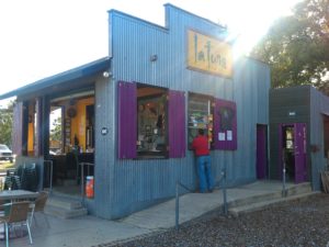
This article was recently posted in the Spaces section of the San Antonio Express-News. This funky home sits in the southern end of Lavaca and is a testament to recycling older commercial spaces into creative residential spaces. The photos were taken by John Davenport who photographed my house for our Spaces article.
Spaces: Studio Dreams – Building goes mod, glammy for couple
By Megan Stacy Special to the Express-News
February 21, 2011
Many artists dream of having a studio and home in the same place. For many years, married artists Joey Fauerso and Riley Robinson lived near the studios they owned but wanted to be even closer.

A prominent focal point of the south central home of Joey Fauerso and her husband Riley Robinson is their centrally located courtyard
Last year they got their chance. The building next door, once a Mexican restaurant and then offices for a credit union, went on the market. Fauerso and Robinson bought the property but weren’t exactly sure how the 3,800 square-foot-office building would become a home.
They had a few ideas, though. They knew they wanted an interior courtyard, which would mean cutting a hole in the center of the building. They also wanted to reflect the building’s ’60s-era architecture in the interior design. They wanted to be resourceful with money and materials. And they wanted white walls to display their art collection.

Living room
Once the interior was demolished, it took four months to rebuild. The couple says they were lucky to collaborate with architect Leslie Anderson of MSA Architecture and contractor Tony Mangold of The Elan Group, whose team was first-class and fast.
“If you stood still, you got put into a wall,” Robinson joked.
Throughout the project, Fauerso and Robinson relied on their artistic training. Robinson, a sculptor, made decisions about proportions and the placement of windows and walls. Fauerso, a painter and video artist, selected colors, textures and patterns for the interior design.
At the center of the home is the courtyard, open to the sky and accessible on all sides by sliding glass doors.
“Cutting the roof open for the center atrium was critical to having a successful, light-filled living space,” Robinson said.

Courtyard
This airiness is augmented by 10-foot ceilings and white walls throughout the home.
The walls were skimmed with mud and painted a flat white to create a plaster effect. It was the contractor’s idea to round off all the edges to soften the wall contours.
The clean walls set off the art found everywhere, from paintings in hallway nooks to sculptures in the dining room. Some art is by friends, like three-dimensional framed scenes by paperwork artist Michael Velliquette. Some represents the couple’s own work, like the square of glass above the bathtub that Robinson etched with the word “Fabulousness.”
With all the white, Fauerso didn’t want the home to feel sterile.
She shopped salvage yards to find distinctive décor. One launching point for the interior design were ’60s-era ceramic light fixtures salvaged from Lackland Air Force Base. Their primary colors and geometric design inspired colors and patterns in the house.
Fauerso used gray and green tile found at the Habit for Humanity ReStore to design a tile pattern for the master bath. She also found Spanish-style tile for the courtyard walls and kitchen backsplash.
Much of the furniture was inherited, but Fauerso shopped at used office supply stores and online to find vintage furnishings reminiscent of the 1960s, like the rattan bedroom set.

Bedroom
She also shopped online resale sites. That’s where she found the dinged metal Kelvinator cabinets for the kitchen, which were refinished in slick, electric blue paint at an auto body shop.

The kitchen area has an open feel to it. The home at one time was a Mexican restaurant and at another time it was a credit union.
“One of the things I love about San Antonio is that it’s such a rich and colorful place, with such overlays of different cultures,” she says. “So I wanted this space to reflect that.”
House Rules
Recycle demolition material: After gutting the interior of the building, Joey Fauerso and Riley Robinson were left with several Dumpsters worth of wood, steel, copper and concrete. Their contractor had the wood mulched, sent the steel to a scrap yard and recycled the copper. The concrete blocks were reused as planters in the yard.
Repeat Elements: In the couple’s home, the white walls unify the rooms. Another repeated material is birch plywood, which was used for the kitchen counter and the 8-foot doors. Birch also was used for bathroom cabinets, custom-made by South Presa Cabinets.
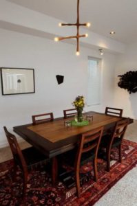
Mix Affordable and Pricey: The couple has invested in some quality pieces like a light fixture by local woodworker Peter Zubiate and custom stools by San Antonio furniture designer Peter Glassford. But they also purchased off-the-shelf items to stay within their project budget and placed them in proximity to the higher-end items. “You can have some really (inexpensive) things if you have some really good things,” Fauerso says.

The dining table in the home has a Peter Zubiate light fixture hanging over it
Respect the Building: During the demolition, six layers of floor linoleum were removed, revealing concrete and terrazzo. The couple kept the terrazzo flooring for the character and to establish the age of the building. They also kept the original entrance, where storefront glass doors lead to a portico where more terrazzo tile is inset with the words “El Rancho,” the name of the restaurant that once occupied the property.

The name of the restaurant that once occupied the property.


