Fannie Mae, Freddie Mac launch foreclosed home summer sale

This article by Ken Harney was recently published in the San Antonio Business Journal. I checked out both of the websites and it doesn’t appear that there are many homes available in our historic districts or center city neighborhoods; mostly along the northern loops of San Antonio. Also, the incentives are for individuals that will occupy the homes and not for investors.

WASHINGTON — Looking for a deal where the home seller pledges in advance to contribute potentially thousands of dollars to your closing costs? If so, check out the summer sale terms available from two of the largest and most motivated sellers of foreclosed homes in the country — Fannie Mae and Freddie Mac.

You may know the companies for their troubled mortgage businesses or the financial foibles that crashed them into the control of federal conservators in 2008. But the flip side of those problems is that they now have massive numbers of properties taken back through foreclosures.

Fannie Mae had 153,549 of them at the end of the first quarter. Freddie Mac owned 65,174. That’s nearly 220,000 houses for which they need to find new owners — quickly — or they’ll rack up even bigger losses for taxpayers.

To move that bulging inventory, both companies have begun time-limited sales campaigns with significant incentives for new owner-occupant purchasers — no investors allowed — and even extra cash for the real estate agents who bring buyers to the table.

Fannie and Freddie both are offering to pay up to 3.5 percent of the price of the house toward buyers’ closing costs, plus they’ll hand over a bonus of $1,200 to participating real estate agents. Fannie’s program covers properties on which contracts are accepted and close no later than Oct. 31. Freddie’s sale requires contracts no later than July 31 and closings by Sept. 30.

Fannie’s program even offers mortgage money to help finance these purchases, sometimes with as little as a 3 percent down payment. The company also has what it calls a “renovation mortgage” option that provides additional mortgage amounts to cover fix-ups.

Freddie does not offer special mortgage financing for buyers during the sale period, but has other inducements including two-year home warranties and 30 percent discounts on appliances.

All the foreclosed properties are listed with photos and descriptions at either HomePath.com (Fannie) or HomeSteps.com (Freddie), where you can search by price, local markets, ZIP codes and entire states. They run the spectrum from expensive detached homes, low-budget urban condos and suburban tract townhouses nationwide. Featured offerings on HomePath recently included:

– A six-bedroom, five-bath house in Littleton, Colo., with 4,990 square feet of space. Asking price: $424,900.

– A two-bedroom condo with 1,164 square feet in Las Vegas for $43,999.

– A $184,900 two-bedroom, one-bath home in Long Beach, Calif.

– A four-bedroom, two-bath house in Brentwood, Md. Asking price: $65,000.

The summer clearance sales are part of rapidly accelerating efforts by both companies to get ahead of the tidal waves of foreclosures flowing into their portfolios in recent months. During the first quarter of this year, Fannie Mae acquired 53,549 properties alone. However, during the same period, it managed to sell off 62,814 houses — a record number that produced a net outflow.

Freddie Mac also sold more foreclosures than it took in during the first quarter, acquiring 24,709 houses while selling 31,628. In some parts of the country, Freddie’s offerings are even stimulating multiple bids on houses, according to spokesman Brad German.

Both companies are targeting only buyers who plan to live in the homes — rather than non-occupant investors who want to flip or rent them out — as part of a larger neighborhood real estate stabilization effort.

The contribution of up to 3.5 percent of the sale price toward the buyers’ closing costs can be substantial. On a $200,000 house the buyers could receive $7,000 toward their closing expenses, which might well be the difference between their ability to afford to buy or not. Combine that with additional incentives, such as favorable financing or warranties, and the total package can look extremely attractive to first-time and moderate-income purchasers.

Are there downsides or restrictions for would-be buyers on either HomePath or HomeSteps? Absolutely. Top of the list: Keep in mind that these are foreclosed properties and some of them have been abused by previous occupants. Fannie and Freddie both do repairs to bring houses up to what they believe are marketable standards, but don’t be surprised to find they are not in pristine condition.

Second, though foreclosures do generally sell for less than non-distressed houses, you need to understand that both Fannie and Freddie are in the business of maximizing returns on assets for their federal creditors. Do not assume the listing prices are deep-discount giveaways. Be diligent in comparing prices and values before bidding and negotiating — just as you would with any other real estate purchase.

Another of my listings is featured in the Express-News

My client, CVF Homes, and I were recently featured in the Express-News for his most recent historic green renovation. He is currently working on two more renovations in Lavaca. Call me if you would like to see the work in progress.

Preserving historic integrity
Lavaca-area home goes green gently

By: Anna Ley for San Antonio Express-News

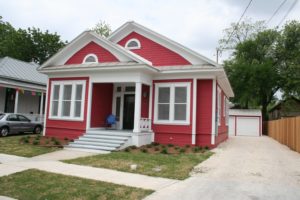
CVF Homes updated this Lavaca home without changing the outside to maintain its historical integrity.

On the outside, Kristal Cuevas’ future home is the picture of historical perfection, a pretty Craftsman-style cottage with bright red walls and thick, white molding.

But inside, the house has a modern, open floor plan packed with new energy-efficient features and state-of-the-art appliances.

The living room of this historically designated home was expanded by tearing down walls to create a more open floor plan. The original floors were insulated and walls were painted to brighten the interior, while the windows were left nearly untouched to maintain their original appearance.

Buiilder Juan Manuel Fernandez installed energy-efficient appliances in the kitchen to meet certification standards set by Build San Antonio Green.

Located in the Lavaca Historic District just south of downtown, the home is being remodeled by builder Juan Manuel Fernandez to be more environmentally friendly and energy efficient while retaining its historic charm. Fernandez, who initiated the renovation and specializes in so-called historic retrofits, is seeking “green” certification for the home through Build San Antonio Green, the city’s residential certification program.

Cuevas and her husband, Eddie, have the house under contract and expect to close on the 1,321-square-foot house by April 15.

Builders, real estate agents and green certification experts say projects like this produce a unique mix of old and new.

Because the home is located in a historic neighborhood and also is designated a historic building through the Texas Historical Commission (thanks to Fernandez’s efforts), its structural integrity must be preserved to meet certification guidelines. The process for remodeling it is more restrictive than it would be for a regular house, Fernandez said. The exterior of a historically designated home can’t be changed structurally. The interior trim and baseboards also have to remain in the home.

“The main issue is the outside because we have to be very cautious to preserve architectural features,” Fernandez said. “It would be very bad to change it because it’s part of its original charm.”

To save energy costs at the house, Fernandez insulated the home’s floors and walls and installed new Energy Star-qualified appliances. He also added low-flow toilets and other water-saving plumbing features in compliance with Build San Antonio Green’s retrofit certification program.

“It had no insulation before,” said Lina Luque, certification manager with Build San Antonio Green. “They didn’t have any (green features), pretty much.”

While he kept the home’s original hardwood floors and French doors — handles and all — the interior of the home was transformed to make it feel more spacious. He also added an extra bathroom.

The home's original French doors - including handles - were preserved.

Overall, the remodeling project cost Fernandez $100,000. Curtis Bowers, a real estate agent with King William Realty and president of the Lavaca Neighborhood Association, said historic renovations for deteriorated homes in the area typically range between $100,000 and $150,000.

“It depends on how much square footage there is in a home, and whether (builders) are buying stuff off the shelf at Home Depot or getting custom” features, Bowers said.

Fernandez is renovating three more homes in Lavaca and plans to complete those within the next six months. So far, he has taken on 10 historic remodels in that area.

Cuevas said one of her favorite features of the home is a brick column that previously was part of a fireplace. The builder tore down the actual fireplace and incorporated the brick column into the kitchen’s countertop, where it creates a division between rooms.

The brick column that was incorporated into the kitchen countertop.

“I love that blend of old and new,” Cuevas said. “I feel like we’ve found a diamond in the rough.”

Luque said she expects the builder likely will attain Level 2 certification through Build San Antonio Green — that means he will increase the home’s energy performance by 50 percent while adding several water conservation features, such as low-flow toilets, sink fixtures and shower heads.

Just two other historic homes in the city are being certified through Build San Antonio Green.

Often one of the most challenging aspects of improving a historic home’s energy efficiency is insulating windows without compromising their appearance, she said. Much of a home’s cool or warm air escapes through crevices around windows so replacing them is the easiest way to keep indoor temperatures steady.

In the case of historic homes, builders instead will seal windows as best as they can and sometimes add solar film, which is barely visible.

“The good thing about this technology is that it has developed so well you can’t even tell it’s there,” Luque said.

Cuevas and her husband decided to move to Lavaca in search for a livelier neighborhood and a house with more character. She also was tired of commuting from her “cookie-cutter house” in Helotes for work every day at her Southtown yoga studio and spending little time at home.

Lavaca is a vibrant area with a busy arts scene and lots of local eateries and drinking spots. Most homes there are Craftsman- or Victorian-style homes. It is served by the San Antonio Independent School District.

The area has seen an influx of young families in recent years who move there to renovate older properties, Bowers said.

The housing stock there is diverse, and it includes fixer-uppers that cost as low as $100,000 to fully renovated homes in the $500,000s.

“Anything purchased under or around $100,000 is purchased fairly quickly,” Bowers said. “There are always a lot of renovations going on.”

Big Tex may see redevelopment

Big Tex revival getting new life

Visions of what a redeveloped site could become are aired at meeting.

By: Valentino Lucio for San Antonio Express-News

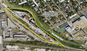
Map of Big Tex

Map of Big Tex

For years, there have been plans to renovate the abandoned Big Tex plant situated along the San Antonio River, near the Blue Star Arts Complex. While environmental issues and a down economy stalled the project, stakeholders are ready to breathe new life into it.

A dialogue started Monday when about 40 people gathered at Blue Star to share their vision for the 7.5-acre development.

Although the plan still is in its infancy and has no funding, the mixed-use development aims to incorporate a boutique hotel, 230 rental lofts, live-work space for artists, retail space, a conference center and a parking garage.

Plus, it would allow the 25-year-old Blue Star Contemporary Arts Center, the main gallery space at Blue Star, to expand from the 12,000-square-foot space it currently occupies and has outgrown. Plans call for it to occupy another 15,000 square feet at the new site, allowing for more space for art exhibits and educational classes.

“We’re practically hanging from the rafters in the facility we have now,” said Bill FitzGibbons, president and executive director for the arts center.

Irby Hightower, principal with Alamo Architects, the designer for the project, said that the existing silos and structures are stable and still can be utilized. The project’s design will resemble the original site, expanding on the industrial and warehouse feel. What could be different is that it could incorporate more outdoor space, which the original 135,000-square-foot arts complex lacks, he said.

The property’s owner,James Lifshutz, said the project still is in the site-planning stage and that there isn’t a timeline for development.

He anticipates the project could cost about $40 million, with funding coming from the public and private sectors. The hope, he added, is that the expansion project, like the original arts complex, could be the economic generator that continues to revitalize the area.

“The same way Blue Star anchored the commercial redevelopment south of Durango Street starting 25 years ago, I think we have the potential to have the same kind of leveraging affect with the Blue Star’s expansion,” he said.

At the meeting, stakeholders chimed in with ideas about what they would like to see at the site. Several suggestions were mentioned, including a farmers market, pharmacy, community garden, grocery store and restaurants.

And with the city’s efforts to redevelop the San Antonio River to the south, some stakeholders said that the expansion project could become the entry point to the San Antonio Missions.

While the future may be bright for the area, the project has had its troubles. In 2009, the Environment Protection Agency finished cleaning up about 2,000 tons of asbestos-contaminated soil from the site, which had been operated as a processing plant for vermiculite ore.

The cleanup cost about $2.75 million and the EPA is seeking reimbursement for the costs. While the project site has been deemed safe, Lifshutz said he hasn’t paid into the cleanup costs and was not aware of any previous owners contributing to the bill.

And with so much negativity connected to Big Tex, the processing plant’s original name, Lifshutz said he will drop that moniker and use Blue Star to refer the entire complex.Although the project still is a dream, Lifshutz said that community involvement in the process is essential to the project’s success.

“I don’t want to give the impression that it’s a done deal, ready to break ground,” Lifshutz said. “On the other hand … we’re trying to make sure that what we eventually design and build is something that will be not only well received by the community nearby but the entire South Side.”

HemisFair Park Proposal approved

City Council approves HemisFair Park framework plan
By: Vianna Davila for San Antonio Express-News

Without discussion, the City Council unanimously approved a plan Thursday to revamp HemisFair Park, an effort that would raze part of the city’s convention center, relocate several current park tenants and enhance connections to the East Side.
Council members vetted the plan at a meeting Wednesday, after a presentation by officials and consultants with the HemisFair Park Area Redevelopment Corp., created to oversee redevelopment of the park.
HemisFair Park officials hope a grand opening for the new park could happen by 2018 — the 300th anniversary of the city’s founding, and the 50th anniversary of HemisFair, the event that creation the park.
But the park likely still won’t be complete by that time, said HPark CEO Andres Andujar.
“I think it will take longer to complete the project 100 percent,” Andujar said Wednesday. “There are pieces of the project that are not completely controllable.”
Those include the vacating of the federal courthouse, on the southern edge of the park. The courthouse is scheduled to relocate to the site of the current police headquarters on Nueva Street but the timeline is uncertain. University of Texas at San Antonio representatives also have discussed relocating the Institute of Texan Cultures within HemisFair Park.
So far, slightly less than $21 million has been set aside for HemisFair. Funding for the convention center work has not been secured.
The framework plan is a draft version of a final master plan, which should be complete by September. The city then will start to look more closely at the financial details of making the project a reality, said Pat DiGiovanni, deputy city manger.
Among the financial resources the city has said it could tap into are public-private partnerships and the hotel occupancy tax.

Changes coming to HemisFair

HemisFair could see a major makeover
By: Vianna Davila for San Antonio Express-News

HemisFair Park Proposal

Consultants are proposing an ambitious plan to revitalize HemisFair Park that could include demolishing part of the Convention Center and relocating the Institute of Texan Cultures within the park.
Calling it a framework plan, consultants working with the HemisFair Park Area Redevelopment Corp. presented the proposals to a packed house Tuesday night at Sunset Station. It was the third such public meeting to discuss the future of the 78-acre park, whose redevelopment has become one of Mayor Julián Castro’s top priorities.
Castro could not be reached late Tuesday for comment on the proposal.
The suggested concepts include streetcar lines in and around the park, a marketplace and mixed-use residential areas.
But the night’s most dramatic proposal was the idea to raze the western, older part of the Convention Center, built in 1968, to clear that area for more green space, open up the park to downtown and expose the San Antonio River.
HemisFair today features 15 acres of dedicated parkland, but only 6.9 acres of that actually is used green space, said Andres Andujar, CEO of the HemisFair Park Revitalization Corp.
“I think you need to open up that corner,” said meeting attendee Gregg Moon with the EastWest Design Group, adding that the change will give the Convention Center, which he believes has limited public use, an urban function.
In exchange for removing the older part of the center facing South Alamo Street, with about 200,000 square feet of exhibit space, the center would be extended on its eastern half.
The plan, still in the early concept phase, includes no cost estimate. But it likely would carry a high price. Expansion of the Convention Center in 2001 cost $215 million.
The city has retained Populous, the Convention Center’s architectural planning consulting firm, to work with the city and the HemisFair redevelopment corporation to further explore the idea.
Populous had completed a facilities development study on the possibility of expanding the Convention Center around the same time the HemisFair Park visioning sessions began, said Michael Sawaya, director of the city’s Convention, Sports and Entertainment Facilities Department.
No funding has been identified to either demolish or extend the center, Sawaya said. Officials still need to determine how to achieve an expansion while keeping the Convention Center competitive.
“They’ve (Populous) got to put into place a plan that takes into account the economic impact, of any construction,” Sawaya said.
The plan, as presented Tuesday, also includes relocating the Institute of Texan Cultures to another spot within the park, possibly into a proposed cultural center linked to the Instituto Cultural de México and the Universidad Nacional Autónoma de México, both current HemisFair tenants.
That would mean razing the institute’s current facility, which is part of the University of Texas at San Antonio, according to Andujar. The removal could clear the way for more high density uses in the southeastern portion of the park, said David Alpaugh, with Johnson Fain, the main consultants working with the redevelopment corporation.
Andujar admitted the concepts are controversial. But a representative from UTSA was at Tuesday’s meeting.
“They’ve seen the plan,” Andujar said. “They’re here tonight.”
Jude Valdez, UTSA vice president of community services, said the university is interested in revitalizing the institute and is “very open to some of the ideas.”
“I think we’d consider moving within the park,” Valdez said.
The park was built for the 1968 World’s Fair and counts among its occupants some of the city’s most visited locations, including the Tower of the Americas and the Convention Center.
Despite vigorous efforts to use the space, such as relocating the city’s arts fair, Luminaria, exclusively to HemisFair this year, the park has largely been underutilized.
Over the past several months, the momentum for a renaissance in the park has built rapidly.
But Tuesday’s proposals gave some attendees pause, including former Mayor Lila Cockrell, who raised concerns about the financial undertaking required for the project.
“Overall, I think the concepts, the principles, are very fine,” said Cockrell, whose name is attached to a theater at the Convention Center. “I think it’s just really being realistic about the cost, how we will pay for some of the proposals.”
“We’re looking at some substantial public investment.”
So far, city leaders have cobbled together a little more than $20 million for the park, including $17.6 million in savings from the 2007 bond issue. The HemisFair redevelopment corporation expects to receive money from the 2012 bond issue. Officials also are looking to form public-private partnerships and a nonprofit.
The framework plan presented this week calls for an enhanced grocery store and marketplace that would be a place “where everyone wants to go and not has to go,” Alpaugh said. Water elements that reflect Spanish colonial acequias that once ran through the city also would be incorporated.
Durango and Alamo streets both would be enhanced to become more pedestrian friendly, a concept the HemisFair consultants called “humanizing.” The creation of mixed-use housing and reconnecting to both the East Side and the Lavaca neighborhood to the south, are encouraged.
The plan for streetcars would include a line that runs through the middle of the park, dips under Interstate 37 and connects to the Robert Thompson Transit Center beside the Alamodome.
But like the plan to raze part of the Convention Center, this idea remains conceptual: VIA Metropolitan Transit is studying a plan to bring streetcars to San Antonio, but the money for a complete streetcar line has yet to be secured.
“We are planning as if we controlled all these properties,” Andujar said. That may not be true today, but the corporation is working to see those partnerships happen, he said.
A draft master plan will be presented at the next HemisFair public meeting, which could happen in two to three months, Andujar said.
“It’s a dream, and it’s in our hands to execute,” he said.

Great front porches are making a comeback

This article was submitted to the Express-News by Tenna Florian, AIA, LEED AP, an architect with Lake/Flato Architects. She gives a great architectural history of the porch and also speaks to its cultural connection in historic neighborhoods. I couldn’t have said it any better myself.


Building San Antonio: It’s time to enjoy your front porch, S.A.

Sunday, May 1, 2011

San Antonio’s historic neighborhoods are full of houses with great front porches. If you are lucky enough to live in one of these homes, now is the time of year to enjoy your porch. The mornings are relatively cool, the afternoons are breezy, and perhaps most importantly, the mosquitoes are not yet out in full force.

More than any other architectural element, the front porch is perceived as a uniquely American element; however, ‘American’ inherently means a product of the cultural melting pot that helped form the many architectural styles found in this country.

The early Colonial period of architecture was mostly devoid of porches, since the majority of the immigrants during this time hailed from Europe, where porches were not common. However, as colonialism in Africa, India, and the Caribbean brought more Europeans into contact with a variation of styles, the front porch became more prevalent.

Another strong influence in the evolution of the American porch was the ‘shotgun house’ (a small, one-room-wide home), built by African slaves in the South. The front porch found in these early homes may have been evidence of African architectural tradition, but easily could have been a response to climate, living conditions, and the desire to be connected to the outdoors and surrounding community.

Eventually, in the 19th and early 20th centuries, the front porch came to represent cultural ideals of family, community, and nature. After dinner, families would retire to the front porch to cool off and socialize among themselves and with neighbors. An inherent sense of security was built in to this setting, as there were now more eyes on the street.

The sense of community that the porch represented declined in the mid-20th century, as more Americans owned their own automobiles and a more suburban way of living began to develop. As the prevalence of the air conditioned home increased, the need to either sit on the porch and cool off diminished. Entering the home through the front door became a rarity as the popularity of the attached garage, which served as a back door point of entry, increased. The garage replaced the porch as the primary architectural feature, in relation to the street, of the front of a home.

But the front porch is making a comeback. A great front porch is seen as an asset when buying a historic home. There are also several new developments with design standards that require a home to have a front porch.

Sadly, many times these porches are more symbolic than they are functional. In order to be functional as more than a front stoop, a front porch should be at least deep enough to hold a chair with passing room in front, and at least wide enough for a porch swing, so that a family can sit comfortably on the porch and commune with nature and neighbors.

Whether you live in a bungalow in Beacon Hill or Mahncke Park, a Victorian Stick Style house in King William (or Lavaca), or any number of historic homes in central San Antonio neighborhoods, now is the time to open up your house, let the breeze come through, and enjoy your front porch.

While you are out there, be sure to acknowledge your neighbors that are also out, enjoying the night air.

TIP: Keep that door from swinging shut

If you live in an older home you will sometime have the problem of doors slowly swinging shut. This can be caused by shifting foundations or out-of-square door opening.

This tip comes from the March 2011 edition of This Old House Magazine.

A door swings open or closed on its own. Pull out one of the hinge pins, lay it on a sturdy work surface, and hit the midpoint of the shaft with a hammer. Then reinsert the pin; the blow will have bent it slightly, providing enough resistance to prevent the unwanted movement.

Check out the updated Historic Downtown walking tour

My friends Elizabeth Porterfield and Shanon Wasielewski are mentioned in this article about the new walking tour. I’m going to have to check out the Conservation Society’s website and download the tour. You should do the same.

New brochure brings history to life

Self-guided tour of downtown has been updated.

By Scott Huddleston of the San Antonio Express News

If you’ve ever wondered where Santa Anna stayed during the Alamo siege or where Teddy Roosevelt outfitted his Rough Riders, you can find out in a newly updated brochure that tells some of the tales of downtown San Antonio.

The Texas Star Trail, created by the San Antonio Conservation Society for the state’s 1986 sesquicentennial, provides a self-guided 2.6-mile walking tour of downtown historic sites.

It includes lesser known jewels such as the O. Henry House, where the famed writer worked in the 1890s, and the Richter House, where barber-surgeon William Richter is said to have used leeches from a nearby irrigation ditch to treat patients.

Blood-sucking worms too weird for your taste? The brochure has been updated to include commentary by Elizabeth Porterfield, architectural historian with the city’s Office of Historic Preservation.

It shows 79 points of interest, identified by aluminum pavement markers, including 29 “must see” stops. The 12-inch circular discs depict the upper half of a Texas star over an outline of the Alamo. About 1,000 blue 3-inch markers line the trail, pointing pedestrians to the next stop.

Tuesday’s announcement of the updated brochure comes during National Preservation Month, as cities across the country celebrate their historic treasures, said Shanon Wasielewski, city historic preservation officer.

“We’re very fortunate that we have so many of them. We have treasures everywhere you look,” Wasielewski said.

The trail is designed to raise the local consciousness and promote exercise and cultural tourism, city officials said. Paula Stallcup, the city’s downtown operations director, said visitors often stare up at building features that locals don’t seem to notice.

“The walking tour is really to highlight that,” Stallcup said.

Since the trail has reached its 25th anniversary, now is the time to revive it, said Rollette Schreckenghost, president of the conservation society, which is trying to find funds to replace several missing markers.

The trail, funded by a $25,000 grant from the Meadows Foundation in 1986, no longer includes one historic house that was burned by an arsonist and three buildings that lost their historic significance in alterations.

The Wolfson Building, at 100 N. Main St. on Main Plaza, is Site No. 35 on the trail. As the home of Wolfson’s Dry Goods and Clothing Store, it was a cornerstone of a retail boom in the plaza in the late 1800s. It’s also on the site where Mexican Gen. Antonio López de Santa Anna is said to have planned his army’s assault on the Alamo in 1836, said Marlene Richardson, the conservation society’s third vice president, who oversaw the route’s update.

Roosevelt’s Rough Riders were outfitted for their famous 1898 charge up San Juan Hill at one saddlery shop in Main Plaza and another nearby at 231 E. Commerce St. A stop at the Tower Life Building, a neo-gothic skyscraper that’s a familiar part of the city skyline, was added to the trail. Richardson recommends a look inside.

“Walk right in there. It’s gorgeous,” and offers relief from the heat, she said.

The brochure is available at conservation society offices, 107 King William St., and the San Antonio Visitor Center, 317 Alamo Plaza, and is posted on the society’s website, saconservation.org/pdf/texasstartrail.pdf.

King William Realty listing featured in Spaces

One of our King William Realty listings was recently featured in the San Antonio Express-News Spaces section. This is an amazing property!

Spaces: A multifamily mess transforms into a neoclassical gem

By Karen M. Davis   Photos by Jerry Lara
Friday, March 4, 2011

When Kevin Browne first saw the three-story neoclassical mansion in the area south of downtown often referred to as Baja King William, it was a far cry from the elegant residence built in 1907 by James Luby, a judge from Duval County.

Its three floors had been broken up into four apartments, with walls in places they weren’t meant to be. A former carriage house in the back had been divided into two small apartments. Both structures had been poorly maintained.

“It was a mess,” Browne says.

But he saw the possibilities and had the desire to bring the house back to its former glory. He bought it and hired an architect to draw up the plans. In July 2008, construction began.

Browne located descendants of the original owners, who gave him photos of the house in its heyday. After almost two years of construction, the renovations were finished last April. And the result is a 4,600-square-foot showplace that combines an early 1900s flavor with modern conveniences.

An old photograph of the home. Photo: SAN ANTONIO EXPRESS-NEWS, JERRY LARA

An old photograph of the home. Photo: SAN ANTONIO EXPRESS-NEWS, JERRY LARA

Outside, large, rounded porches are supported by tall cypress columns with carved capitals. Each floor has its own porch, and the upper porches offer great views of downtown.

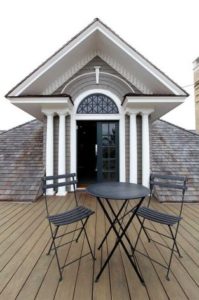
The Brownes can relax and enjoy the view from the third-floor balcony. It faces downtown and offers a great view of New Year’s Eve fireworks. Photo: SAN ANTONIO EXPRESS-NEWS, JERRY LARA

The Brownes can relax and enjoy the view from the third-floor balcony. It faces downtown and offers a great view of New Year’s Eve fireworks. Photo: SAN ANTONIO EXPRESS-NEWS, JERRY LARA

Inside, Browne restored the original long-leaf pine floors. There are seven fireplaces. The high ceilings and large windows popular in an era before air conditioning give the interior an expansive feel.

The main staircase features detail crafted pillars. Photo: SAN ANTONIO EXPRESS-NEWS, JERRY LARA

The main staircase features detail crafted pillars. Photo: SAN ANTONIO EXPRESS-NEWS, JERRY LARA

The entry room’s fireplace has a marble surround that Browne ordered from New York to replace the original brick structure. Built-in storage benches flank the fireplace. A round table in the center of the room sits on a zebra-skin rug that Browne’s wife, Jody, bought at the annual Olé Marketplace.

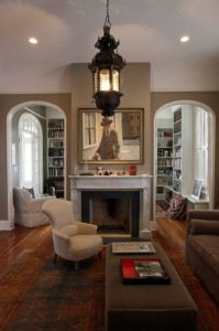
The adjacent library has another fireplace, bookshelves and an antique Persian rug. Behind the library is the family room, featuring a chandelier a friend brought back from Morocco and a marble fireplace that once was in the Plaza Hotel in New York.

The sitting room is located between the library and the dining room and features a chandelier from Morocco. The marble fireplace originally was in New York’s Plaza Hotel. Photo: SAN ANTONIO EXPRESS-NEWS, JERRY LARA

The sitting room is located between the library and the dining room and features a chandelier from Morocco. The marble fireplace originally was in New York’s Plaza Hotel. Photo: SAN ANTONIO EXPRESS-NEWS, JERRY LARA

The library room is located to the left of the front entrance and features a fireplace. Photo: SAN ANTONIO EXPRESS-NEWS, JERRY LARA

The library room is located to the left of the front entrance and features a fireplace. Photo: SAN ANTONIO EXPRESS-NEWS, JERRY LARA

Behind the family room is the formal dining room — an oval room with a coved ceiling and a mahogany fireplace. The dining table is an antique purchased from a friend, and the chairs are a “vintage find,” Jody Browne says.

The formal dining room of Kevin and Jody Browne’s home is oval shaped and features the original windows and a mahogany fireplace. The table and chairs are antiques. Photo: SAN ANTONIO EXPRESS-NEWS, JERRY LARA

The formal dining room of Kevin and Jody Browne’s home is oval shaped and features the original windows and a mahogany fireplace. The table and chairs are antiques. Photo: SAN ANTONIO EXPRESS-NEWS, JERRY LARA

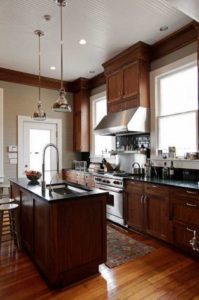
Off the dining room is the former butler’s pantry, which now is used as a breakfast room and wine storage and serving area. The adjacent kitchen has been updated with black soapstone counters, an island and walnut cabinets. A big Wolf stove dominates one wall.

A view of the kitchen. Photo: SAN ANTONIO EXPRESS-NEWS, JERRY LARA

A view of the kitchen. Photo: SAN ANTONIO EXPRESS-NEWS, JERRY LARA

On the second floor, a sign painted on one door says “smoking room.” It’s now used as a music room. An unusual feature is the triple-hung casement window that’s used instead of a door to access the second-floor porch.

Next to the music room is an office, also with its own fireplace, and the back of the house includes the master suite and an enclosed back porch that has space for a day bed, eating area and laundry. The master bath is done in limestone, with op-art tiles in the walk-in shower.

The master bath has a modern walk-in shower. Photo: SAN ANTONIO EXPRESS-NEWS, JERRY LARA

The master bath has a modern walk-in shower. Photo: SAN ANTONIO EXPRESS-NEWS, JERRY LARA

The third floor is an open area with large closets, a kitchen and a bathroom. It’s the domain of Jody’s 15-year-old son.

The third floor bath has hardwood floors and classic fixtures. Photo: SAN ANTONIO EXPRESS-NEWS, JERRY LARA

The third floor bath has hardwood floors and classic fixtures. Photo: SAN ANTONIO EXPRESS-NEWS, JERRY LARA

While the house is large, the rooms have been kept their original sizes.

“I love that,” Jody says. “It’s cozy, even though it looks so huge from the outside.”

Funky Lavaca home

This article was recently posted in the Spaces section of the San Antonio Express-News. This funky home sits in the southern end of Lavaca and is a testament to recycling older commercial spaces into creative residential spaces. The photos were taken by John Davenport who photographed my house for our Spaces article.

Spaces: Studio Dreams – Building goes mod, glammy for couple

By Megan Stacy Special to the Express-News
February 21, 2011

Many artists dream of having a studio and home in the same place. For many years, married artists Joey Fauerso and Riley Robinson lived near the studios they owned but wanted to be even closer.

A prominent focal point of the south central home of Joey Fauerso and her husband Riley Robinson is their centrally located courtyard.

A prominent focal point of the south central home of Joey Fauerso and her husband Riley Robinson is their centrally located courtyard

Last year they got their chance. The building next door, once a Mexican restaurant and then offices for a credit union, went on the market. Fauerso and Robinson bought the property but weren’t exactly sure how the 3,800 square-foot-office building would become a home.

They had a few ideas, though. They knew they wanted an interior courtyard, which would mean cutting a hole in the center of the building. They also wanted to reflect the building’s ’60s-era architecture in the interior design. They wanted to be resourceful with money and materials. And they wanted white walls to display their art collection.

Living room

Living room

Once the interior was demolished, it took four months to rebuild. The couple says they were lucky to collaborate with architect Leslie Anderson of MSA Architecture and contractor Tony Mangold of The Elan Group, whose team was first-class and fast.

“If you stood still, you got put into a wall,” Robinson joked.

Throughout the project, Fauerso and Robinson relied on their artistic training. Robinson, a sculptor, made decisions about proportions and the placement of windows and walls. Fauerso, a painter and video artist, selected colors, textures and patterns for the interior design.

At the center of the home is the courtyard, open to the sky and accessible on all sides by sliding glass doors.

“Cutting the roof open for the center atrium was critical to having a successful, light-filled living space,” Robinson said.

Courtyard

Courtyard

This airiness is augmented by 10-foot ceilings and white walls throughout the home.

The walls were skimmed with mud and painted a flat white to create a plaster effect. It was the contractor’s idea to round off all the edges to soften the wall contours.

The clean walls set off the art found everywhere, from paintings in hallway nooks to sculptures in the dining room. Some art is by friends, like three-dimensional framed scenes by paperwork artist Michael Velliquette. Some represents the couple’s own work, like the square of glass above the bathtub that Robinson etched with the word “Fabulousness.”

With all the white, Fauerso didn’t want the home to feel sterile.

She shopped salvage yards to find distinctive décor. One launching point for the interior design were ’60s-era ceramic light fixtures salvaged from Lackland Air Force Base. Their primary colors and geometric design inspired colors and patterns in the house.

Fauerso used gray and green tile found at the Habit for Humanity ReStore to design a tile pattern for the master bath. She also found Spanish-style tile for the courtyard walls and kitchen backsplash.

Much of the furniture was inherited, but Fauerso shopped at used office supply stores and online to find vintage furnishings reminiscent of the 1960s, like the rattan bedroom set.

Bedroom

Bedroom

She also shopped online resale sites. That’s where she found the dinged metal Kelvinator cabinets for the kitchen, which were refinished in slick, electric blue paint at an auto body shop.

The kitchen area has an open feel to it. The home at one time was a Mexican restaurant and at another time it was a credit union.

The kitchen area has an open feel to it. The home at one time was a Mexican restaurant and at another time it was a credit union.

“One of the things I love about San Antonio is that it’s such a rich and colorful place, with such overlays of different cultures,” she says. “So I wanted this space to reflect that.”

House Rules

Recycle demolition material: After gutting the interior of the building, Joey Fauerso and Riley Robinson were left with several Dumpsters worth of wood, steel, copper and concrete. Their contractor had the wood mulched, sent the steel to a scrap yard and recycled the copper. The concrete blocks were reused as planters in the yard.

Repeat Elements: In the couple’s home, the white walls unify the rooms. Another repeated material is birch plywood, which was used for the kitchen counter and the 8-foot doors. Birch also was used for bathroom cabinets, custom-made by South Presa Cabinets.

Mix Affordable and Pricey: The couple has invested in some quality pieces like a light fixture by local woodworker Peter Zubiate and custom stools by San Antonio furniture designer Peter Glassford. But they also purchased off-the-shelf items to stay within their project budget and placed them in proximity to the higher-end items. “You can have some really (inexpensive) things if you have some really good things,” Fauerso says.

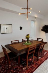
The dining table in the home has a Peter Zubiate light fixture hanging over it.

The dining table in the home has a Peter Zubiate light fixture hanging over it

Respect the Building: During the demolition, six layers of floor linoleum were removed, revealing concrete and terrazzo. The couple kept the terrazzo flooring for the character and to establish the age of the building. They also kept the original entrance, where storefront glass doors lead to a portico where more terrazzo tile is inset with the words “El Rancho,” the name of the restaurant that once occupied the property.

The name of the restaurant that once occupied the property.

The name of the restaurant that once occupied the property.